The Experience page is where you can drill down into your experience and operational data, find actionable insights, and identify improvement areas.
The page can be broken down into four main sections:
Please note that if you click on a specific shortcut on your Dashboard, you will be taken to the Experience page, which shows the data based on the filters saved for that shortcut.
1 Top-level selections
Use these selections to do a top-level of filtering of the data you want to analyze.
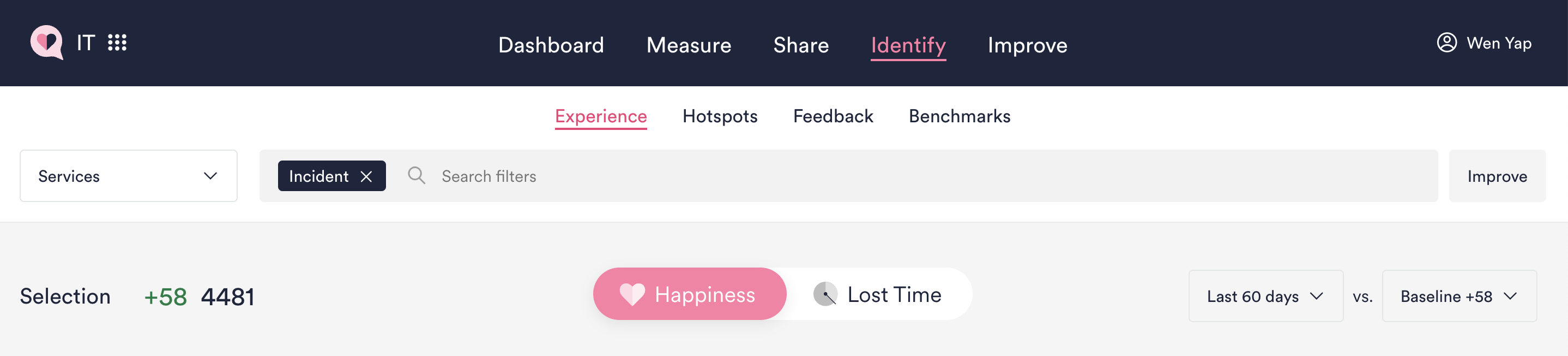
- Measurement Area dropdown menu: Use the dropdown to the left of the filter bar to select the measurement area you want to view. For most users measuring Services with Ticket-based surveys, this dropdown will show "Services" by default.
If you have Proactive surveys in use (e.g., Enterprise Applications, Laptops, Computers, etc.), you can select the corresponding tabs to view data from those areas. Select "Service Portal" if you want to see data from your Portal Experience surveys.
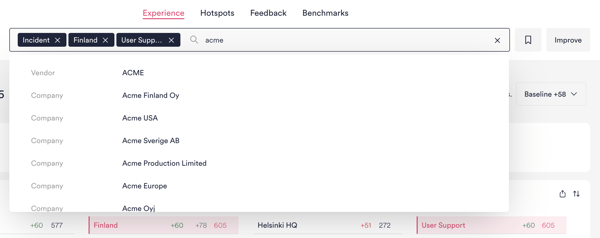
- The Filter / Search bar allows you to manually search for filters. Any filters you select on the Experience page will also be reflected here.
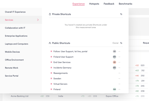
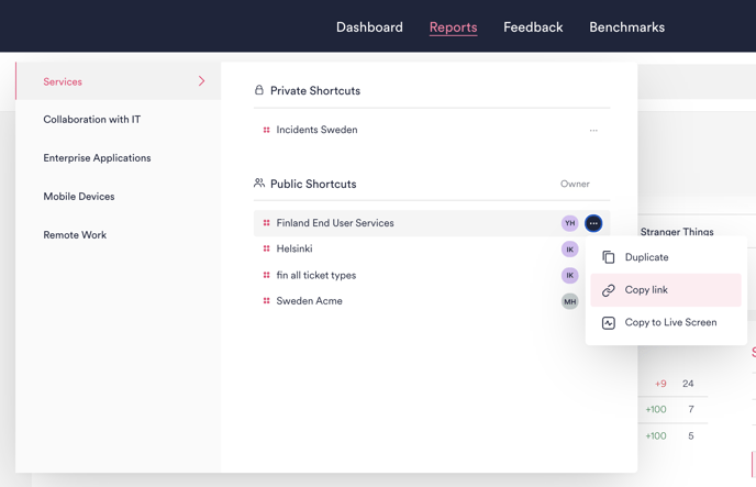
- Click the icon to the right of the search bar to create a Shortcut with your selected filters so that you can easily return to your pre-filtered data with one click. Once saved, your Shortcuts can be accessed both from the Dashboard and from the Measurement Area dropdown menu.
- Toggle between Happiness or Lost time to look at your data from either perspective.
- Toggle between Incidents and Requests if you're looking at Services data: Switch between "Incident" and "Request" with the buttons at the top. Your selection will be highlighted in pink. Note: "Incident" is selected by default.
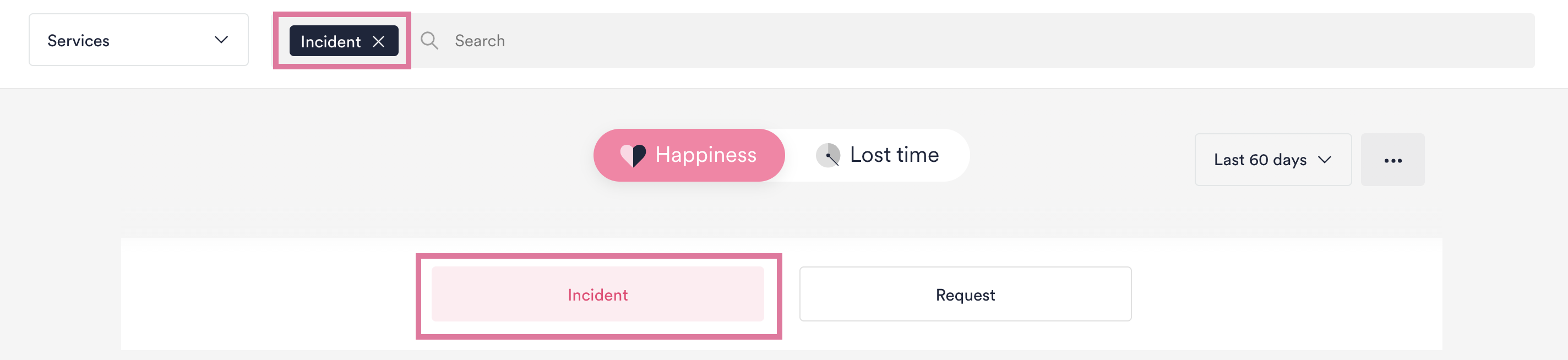
To see Happiness and Lost Time across both Incidents and Requests, simply deselect both buttons so that they are white.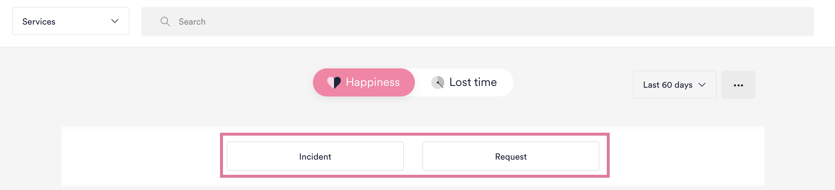
- Select the time period you want to view data from with the dropdown on the right. You can use pre-defined periods like the Last 30 days and Last 6 months or choose a custom date range.
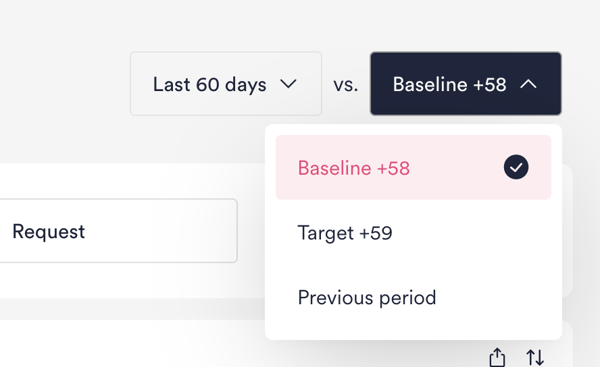
- Choose between comparing your data with Target, Baseline, or Previous period. All data on the page will be colored red or green depending on whether Happiness / Lost Time is better or worse than the Target or Organization Baseline, whichever you select. If you choose Previous period, change since the previous equivalent time period will be shown next to the data for the current time period.
Watch this demo to learn more comparing to Baseline or Previous period.
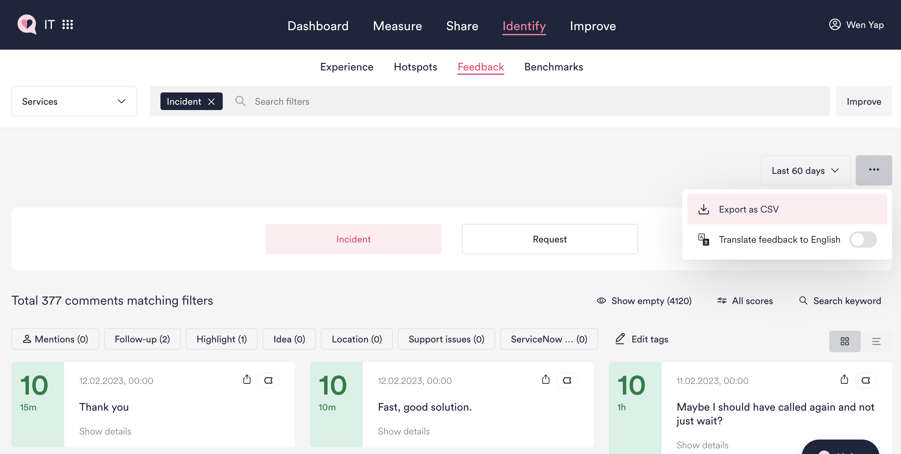
- You can download an Excel sheet of your filtered data via the Feedback page (previously also accessible via the Experience page). Make sure you select all the filters you need to make the download meaningful to you.
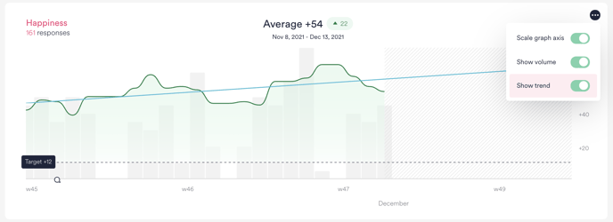
2 Happiness and Lost time graph
When switching between Happiness or Lost time, you will see the graphs for each one of them. The title of the graph will summarize, depending on your choice between Happiness and Lost time:
- Happiness or Lost time average for the filters and time period selected
- Total number of feedbacks received for the filters and time period selected
Note that the number of responses received for Happiness and Lost time can vary. This is because some employees do not answer the survey questions that ask them to estimate their lost work time.
Sometimes the average Happiness or Lost time (in the graph title) is different from the daily values shown when hovering on the graph. This is because the daily values are calculated as weighted rolling averages from the previous seven days. It allows us to "smooth out" the graph to avoid big dips and spikes when response volume suddenly and significantly changes. Read more here.
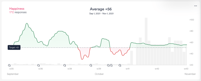
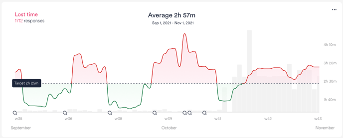
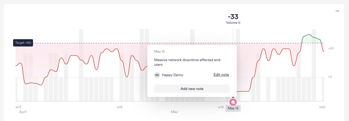
- View the daily Happiness by hovering over the graph.
- Add Notes to annotate the graph timeline, e.g., for major events. Hover over the bottom line of the graph and click on the + icon that appears. Any Notes you create will be visible to all HappySignals users in your organization.
- Monitor trends in Experience and see if you are on the right track to meet or exceed experience targets. Learn more about how trends are calculated.
3 Filters
The middle part of the Experience page is where you can drill down into operational data categories, which you've configured in the integration between HappySignals and your ITSM tool. Commonly used filters include:
Assignment group, country, company, services, IT profiles, Lost time distribution, score distribution, channel breakdown, vendors, reassignment counts, CI, region, location, language, and more.
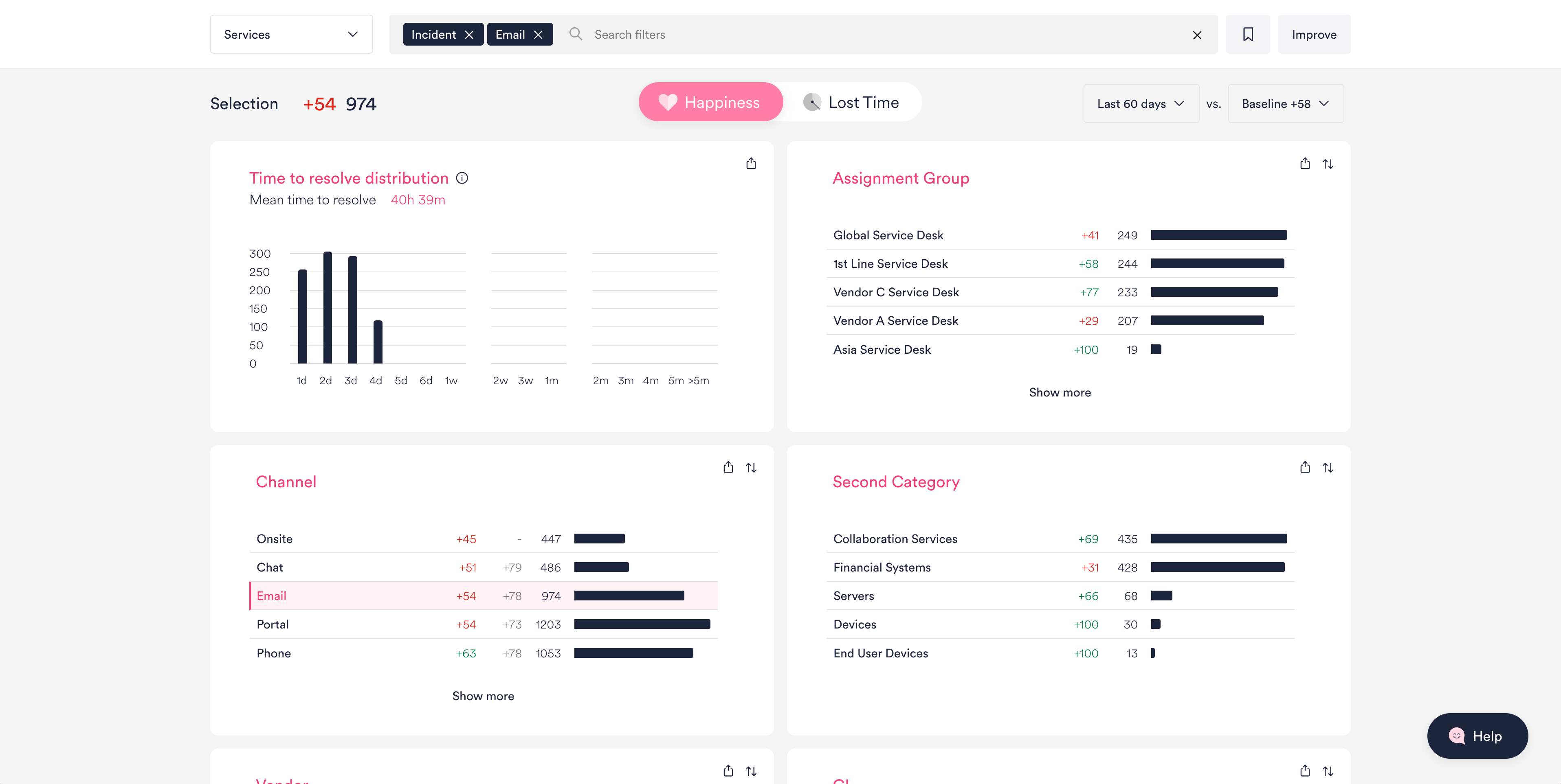
- Each filter title shows numbers for Happiness or Lost time, HappySignals Global Benchmark (where available), and Response Volume.
- Click any title to filter the data you're viewing further. This will allow you to drill down into how end-users are experiencing different channels, assignment groups, vendors, etc., and identify focus areas.
- Admins can customize the Experience page view for their organization's users by going to Settings > Filters/Configure. Should you have any questions, feel free to contact us at support@happysignals.com.
4 Factors
At the bottom of the Experience page, you can see the Factors that your end-users said influenced their experiences most.
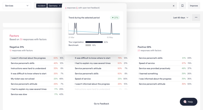
- Factors are divided into Negative (0-6), Neutral (7-8), and Positive (9-10) based on the Happiness rating given by the end user. Read more about the Factors that end-users can choose from in HappySignals surveys.
- The percentages show how much each Factor has been selected. Hover to see the number of responses and open text feedback received from responses in which that Factor was selected.
Learn more: How do you interpret the factors, and what do the colors mean?