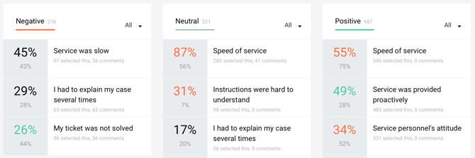
The percentage value
The percentage value tells you how many of all respondents selected that specific fExperience Indicator as a reason for their good or bad service experience. Respondents can select several reasons per incident. The list view of the Experience Indicators always shows those reasons first that have been selected most often (biggest percentage).
You can compare the percentages of your organization (green, red or black, with bigger font) to the benchmark data percentages of all our other customers (grey, with smaller font). This helps you understand how your organization and services are performing when compared to other customers.
The color coding
When your organization results are 10 to more points better than the benchmark, they are colored green. When they are worse 10 or more points they are colored red. When close to benchmark (-9) - (+9) they are colored black.
Note that for negative and neutral Experience Indicators ”better” (color green) means smaller percentages as you are trying to reduce these Experience Indicators and ”worse” (color red) means bigger percentages. For positive Experience Indicators it is the other way around; ”Better” (color green) means bigger percentage and ”worse” (color red) means smaller percentages, as you are trying to increase the amount of positive Experience Indicators.
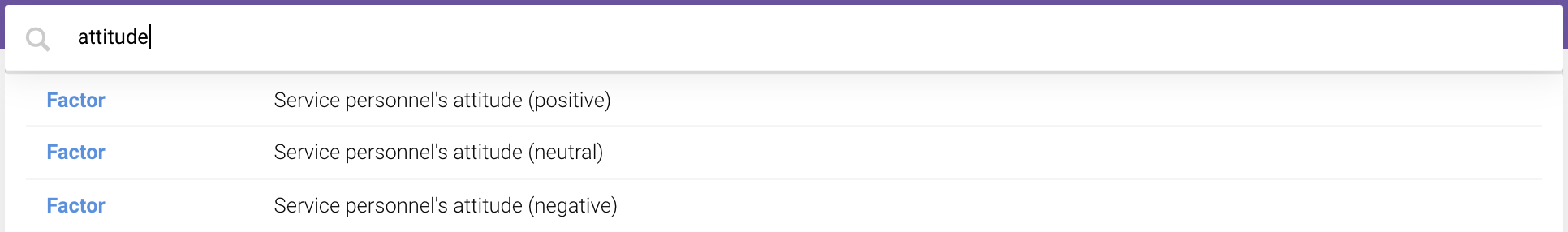
Searching the Experience Indicators
Can can also find out which Experience Indicators have been selected for which services by using the search bar. Each of the selected Experience Indicators can be found by typing the Experience Indicator, or a word appearing in the Experience Indicator, in the search bar as shown below:
You can select the positive, neutral or negative results and find out the affected services or other categories.