Related overview: What is the revamped Platform Dashboard?
Before you start
- Scope: The Dashboard provides a fast, accurate view of the Measurement Areas (MA) and guides you to the right page for deeper analysis.
- Timeframe: The Dashboard always uses a 6‑month timeframe. When you open deeper pages via Dashboard links, the same 6‑month window follows, so numbers match. Using the main navigation does not carry the 6‑month selection over.
- Focus Areas: If your organization uses Focus Areas, they act as a context filter on the Dashboard (no manual filtering on the Dashboard itself).
The layout at a glance
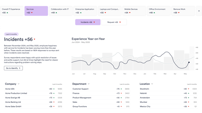
- Measurement Area navigation – shows only MAs that are activated and have responses within the last 6 months.
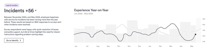
- Top element (MA overview) – a concise 6‑month snapshot with three MA‑specific insight cards; a 12‑month trend is available from the top element.
- Experience Drivers – shows what drivers impact experience most and how employees feel about it (positive vs. negative+neutral). Benchmarks appear when there is a notable deviation.
- Focus Topics – AI surfaces the top free‑text themes for your MA (Deliver & Drive packages).
Measurement Area navigation
What you see: Only the MAs that are activated and have responses in the last 6 months appear in navigation, keeping the list relevant.

Tip: If you set a Focus Area, the Dashboard uses it as context without additional filtering steps.
Top element – read the MA overview fast
Purpose: Provide an executive‑level view of the current state for the selected MA in 6 months, with a route to deeper analysis.
How it works
- The top element summarizes the 6‑month situation. A 12‑month trend opens from the top element for a longer perspective.
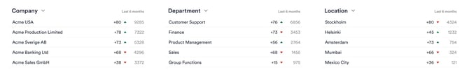
- The three insight cards mirror the first three Top Filters on the Experience page for this MA (company‑level defaults).
- Personalization: If a user changes one of the three cards, all three become that user’s private set (company changes won’t overwrite the user’s personal selection).
- Drill‑down: Clicking a card opens the Experience page with the same 6‑month window, so figures remain consistent.
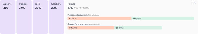
Experience Drivers – what areas drive experience most
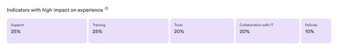
Purpose: Identify what matters most for experience and whether each driver is perceived positively or needs improvement.
How to read it
- Category width = relative importance. The wider the Experience Driver bar, the larger its share among all selected experience indicators (the biggest influencers appear wider).
- Click to expand a category and see individual XIs split into green (positive) and red+neutral (needs improvement) shares.
- Benchmark deviation (!) appears when your positive/negative share differs from the global benchmark by ≥ 5 percentage points (hover to see how much better/worse you are, based on the last 6 months).
- The XI element is visible only if your surveys include Experience Indicator questions.
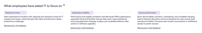
Focus Topics – what employees ask you to focus on
Purpose: Surface the top improvement themes from your organization’s free‑text feedback for the selected MA.
How it works
- AI recognizes roughly 10–30 global themes per MA and classifies your last 6 months of feedback into those themes.
- The Dashboard shows your top three themes; the full list and underlying comments are available on the Feedback page.
- Availability: Focus Topics appear in Deliver & Drive (not in Discover).
Timeframe & filters – rules of the road
- Dashboard timeframe: fixed to 6 months.
- Drill‑downs from the Dasboard carry the 6‑month selection to destination pages (Identify / Experience / Feedback).
- Main navigation moves do not carry the 6‑month window.
- Filtering on the Dashboard: There are no manual filters. Links set the appropriate context on the target page. Focus Areas, if configured, act as the Dashboard context.
FAQ & troubleshooting
Why do I only see some Measurement Areas?
The Dashboard shows MAs that are activated and have responses within the last 6 months, keeping navigation relevant.
Clicking a card changes the numbers on the next page. Why?
Ensure you navigated via a Dashboard link; those links preserve the 6‑month timeframe, so numbers match between pages. Using the main navigation won’t carry the timeframe.
I don’t see Focus Topics.
They appear in Deliver & Drive and use recent free‑text data. If you’re on Discover or have too little free‑text volume, the element won’t be shown.
Where are the filters on the Dashboard?
The Dashboard has no manual filters. It’s designed for clarity; links set context on the destination page. Focus Areas (if configured) apply as a context on the Dashboard.
Admin checklist (optional)
- Keep the Experience page Top Filters up to date for each MA (affects the three insight cards).
- Ensure Experience Indicator questions are included in surveys for MAs where you want XI to appear.
- For Focus Topics, verify the package (Deliver/Drive) and the recent free‑text volume.
Related articles
- What is the revamped Platform Dashboard? – General overview; positioning & benefits'
- Focus Areas – setup & best practices – how to define and use Focus Areas for consistent context across MAs