Available on Feb 19, 2026
Related article: Dashboard - How to use
Introducing the Dashboard in HappySignals
The new Dashboard in the HappySignals Platform is a modern, user‑friendly dashboard designed to instantly answer three essential questions:
- How is IT performing across the Measurement Areas?
- What is important for users in this Measurement Area?
- Where should we focus next?
This view is especially valuable for leaders, service owners, and occasional platform users. It provides a fast, easy‑to‑digest summary without requiring deep exploration.
Core purpose of the new dashboard:
Give every user — including first‑time users — a clear, meaningful picture of IT experience at a glance, and guide them naturally to deeper insight when needed.
What’s on the Dashboard (at a glance)
- 6‑month performance overview, with access to a 12‑month long‑term trend
- Three Measurement‑Area‑specific insight cards that users can personalize
- An Experience Driver element showing what contributes most to experience in the selected Measurement Area
- Focus Topics based on employees’ free‑text feedback
-
For group‑level insights, see the Employee Overview tab
This is a clear starting point that routes users to Identify, Experience, or Feedback for deeper exploration.
What the Dashboard focuses on (per Measurement Area)
-
Understand the current situation easily
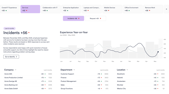
Get a concise, at‑a‑glance view of the Measurement Area you’re responsible for — current experience level and direction of change — so you can see everything that matters in one place.
-
See what matters most to your employees
The Experience Driver element shows which topics have the greatest impact (larger boxes = higher relative importance) and how people feel about each one (positive vs. needs‑improvement). Example: “Speed of service” can often be the biggest driver — for better or worse — depending on your data.
-
Know what employees ask IT to focus on
Focus Topics uses AI to analyse your organization’s free‑text feedback and surface the top improvement themes for the selected Measurement Area (top three on the Dashboard, full list on the Feedback page).
Key Elements on the Dashboard
-
A Big‑Picture View of Your IT Experience
Quickly see: overall experience level, the direction of change, and which operational filters matter most (e.g., Department, Location, Device Type).
Note: We intentionally focus on trend direction here (not red/green target comparisons), to make the view easy to interpret for all users.
-
Three customizable insight cards
-
Based on the first three Top Filters on the Experience Page (company‑level defaults)
-
If a user edits one card, all three become a personalized set
-
Clicking a card opens the Experience Page with the same 6‑month window
-
-
Experience Drivers — what has the biggest impact on experience
This element helps you understand where to focus to influence the experience the most:
-
Relative importance: how strongly each area contributes to the experience
-
How employees feel about each Experience Driver: the share who feel you do it well vs. those who feel it should improve
-
Benchmark deviation (!) icon appears when your XI sentiment differs from the global benchmark by ≥ 5 percentage points (hover to see how much better/worse, based on the last 6 months; uses HappySignals global benchmark)
The XI element is shown only if your surveys include Experience Indicator questions.
-
-
Focus Topics
Identifies top improvement areas based on what employees actually write in free‑text feedback:
- Every ~6 months, AI recognizes ~10–30 global themes per Measurement Area
- Your organization’s last 6 months of feedback is mapped to these themes
- The Dashboard shows your top 3 topics; the rest are available on the Feedback page
This helps busy IT teams prioritize what employees talk about most — enabling pragmatic, high‑ROI improvements.
Availability: Focus Topics are not included in Discover.
Dashboard Behaviour and Navigation Details
Timeframe logic
- The Dashboard timeframe is fixed to 6 months
- This window follows when navigating from the Dashboard to deeper pages
- It does not follow when changing sections via the main navigation
- A 12‑month trend is available via the top element
Measurement Areas in navigation
Shows only Measurement Areas that are activated and have responses in the last 6 months.
Benchmark deviation (!)
A deviation icon is displayed when your XI sentiment differs from the global benchmark by ≥ 5 percentage points.Hovering the icon shows:
- how much better or worse your organization performs
- compared to other HappySignals customers
- based on data from the past 6 months
Important: The XI element is visible only if your surveys include Experience Indicator questions.
Summary
The new Dashboard provides:- an instant overview of employee experience
- clear 6‑ and 12‑month trends
- personalized insight cards
- powerful XI‑based theme insights
- AI‑driven Focus Topics
- a clear starting point for new and experienced users alike