The Dashboard provides you an "at glance" overview of how end-users feel about IT. It is divided into three sections:
The top bar of the menu contains navigation elements to the different Service Areas that your organization is currently using HappySignals for.
In this example, the Service Area is IT. It could also be HR, Finance or other enterprise supporting services.
The main view of the dashboard is the "Your IT at a glance" view.
By default, the view shows the Happiness of the services in the selected Service Area. 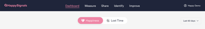
In order to see a different point of view in the "At a glance" view, simply toggle between Happiness and Lost Time, or use the time frame selector on the right to choose a different period.
The time selector impacts all data on the Dashboard page.
The default time frame is 60 days.
1 Your IT at a glance
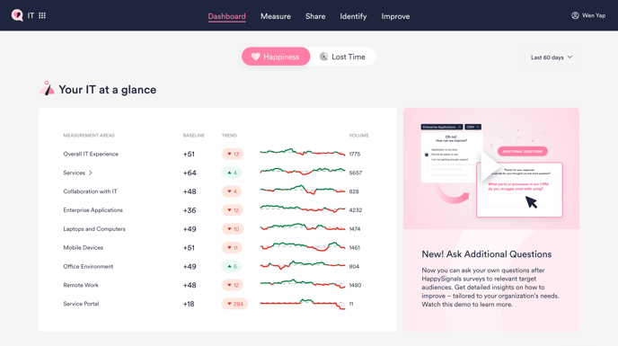 This view is the new starting point to understand how different measurement areas are doing among end-users.
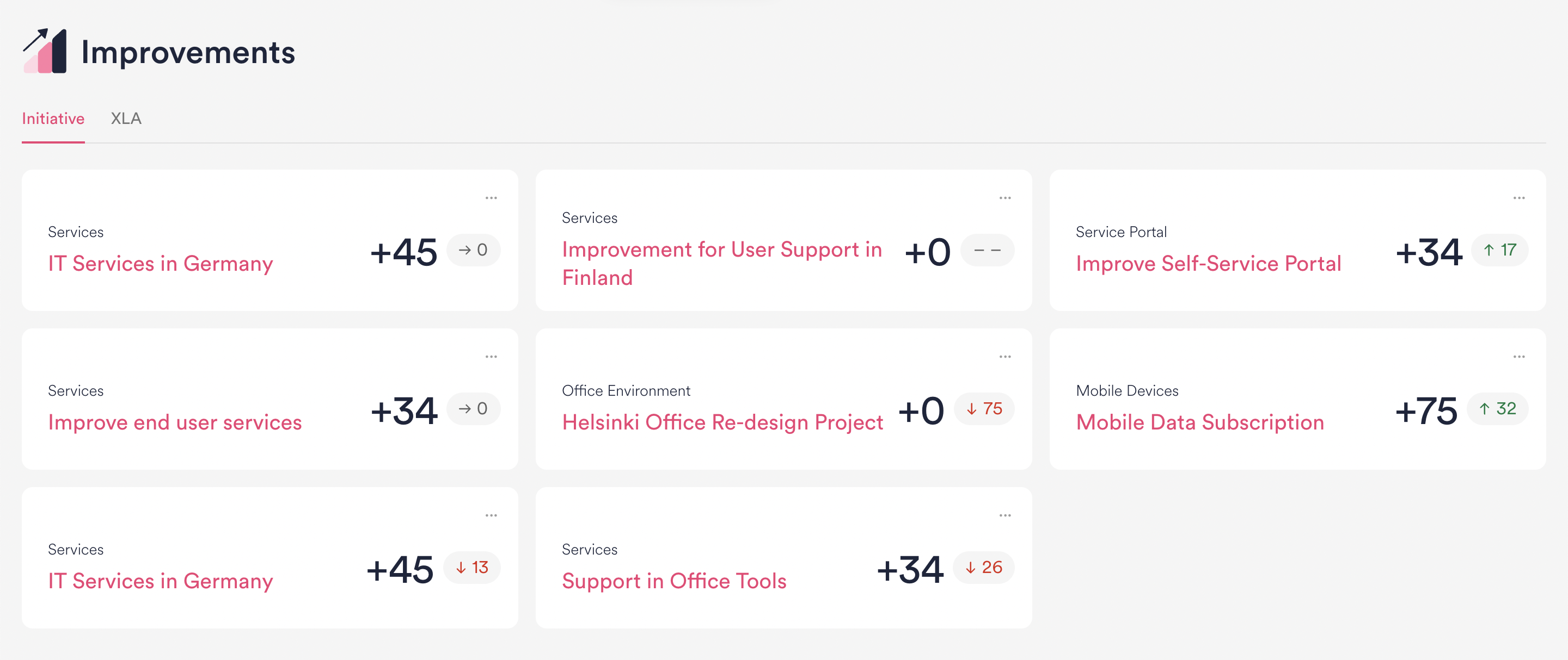
 2 Improvements
Easily access any Initiative or XLA created in your organization from here.
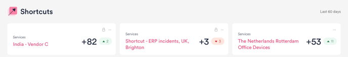
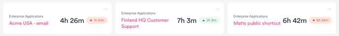
3 Shortcuts
Shortcut view with Happiness as the selected metric
Shortcut view with Lost Time as the selected metric
Shortcuts can be private or public.
Private shortcuts are indicated by the lock icon
The Shortcuts are your quick access to pre-defined filter settings. In the dashboard view, you will see the following information in the Shortcut item:
- Measurement Area
- The user-defined name of the shortcut
- The score in the selected time period
- The trend of the happiness/lost time in the selected time period.
- Green means positive trend
- Red means negative trend
- Grey means no change or not enough data
- Sharing options (...) selection with options to
- Copy the shareable link to a view of the applied filters in the shortcut view.
- Create a Live Screen view with shortcut filters applied
Shortcuts are the most common way to share experience data with other stakeholders and allows everyone to have a shared understanding based on real-time data in one common view.
New shortcuts are created on the Reports page. How to create a shortcut can be read here.
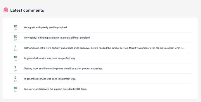
4 Latest comments
The bottom section of the Dashboard page lists the latest scores and the related open text feedback/comments end-users have provided in their survey responses. To investigate more in-depth into the comments please visit the Feedback tab.