HappySignals vs NPS
Response to the question ”How does HappySignals differ from NPS?”
Gartner stated in a press release in May 2021 that “Gartner Predicts More Than 75% of Organizations Will Abandon NPS As a Measure of Success for Customer Service and Support by 2025”
It is important to note that the criticism is in the actionability of the data in the specific use case of customer service and support.
The desired outcome was to identify valuable CX metrics that positively evaluate and affect loyalty.
The shortcomings of NPS were considered from customer service and support point of view, where actionable insights were seen as less satisfactory due to:
- Broad language that makes the score reflect a broader perception, making it indicative of “more than just customer service”.
- The potential impact of price and quality of products on the evaluation – when asked the NPS-specific question of “Would you recommend…”
Why HappySignals is different
The specificity of NPS is the use of the wording “Would you Recommend…”.
When recommending products or services, humans are likely to consider the bigger picture, not just the last interaction. We agree with Gartner that the combination of the wording “would you recommend…” which produces an overall score without the context-specific information, could lead to data that is not actionable.
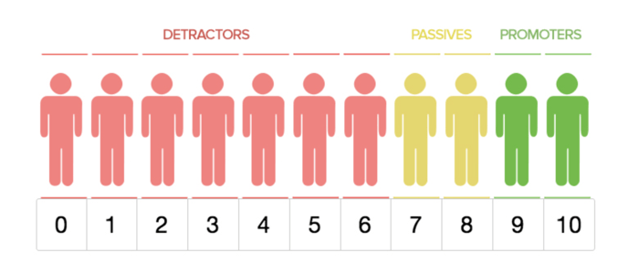
NPS Score logic
HappySignals is not the same as NPS. Our product combines 3 proprietary indicators (Happiness, Lost time, and Factors) and combines the results with the operational data from ITSM tools.
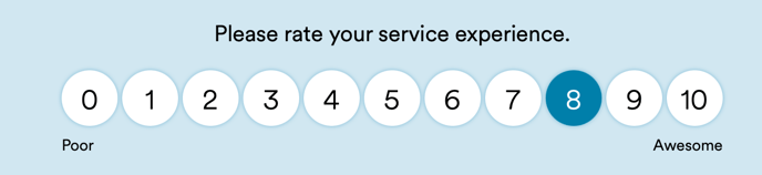
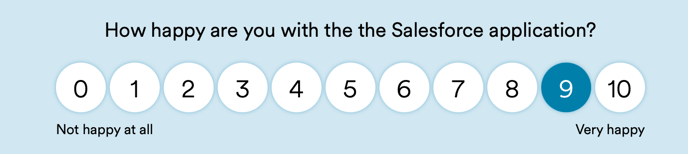
All surveys use targeted language with both survey and score-specific content. Images below display only the score, but each survey also collects data about perceived lost time + factors that were behind a positive, neutral or negative experience.
Data collection and calculation
- How happy they were with (name of service/application/IT touchpoint) received?
- What the (standardized) factors were that led to that happiness?
- Different factors for negative, neutral, and positive scores.
- Different factors for each survey for actionable insights in each measurement area.
- How much productive work time they perceived having lost?
The only similarity is the way the score is calculated by calculating the Happiness through
(% of 9-10 answers) – (% of 0-6 answers) = Happiness
Context-specific survey delivery
Our IT incident and IT request surveys are sent out when the case has been resolved, and always specifically target that interaction with IT.
Our proactive surveys, which often replace yearly surveys, always ask about happiness with a specific IT touchpoint, called “measurement area” within IT.
Researched and perfected to provide actionable data for IT organizations
Survey respondents will consider their responses based on the question asked. That is why we have perfected our standardized surveys over the years to provide actionable insights that can function as the basis for resource allocation.
Our customers have on average increased end-user happiness by 24% and end-user perception of productivity gains by 26%. That number reflects the scores of the first two months of HappySignals use and the last two months of HappySignals use.