The Hotspots page is where you can create heat maps to expose hidden experience gaps from your data.
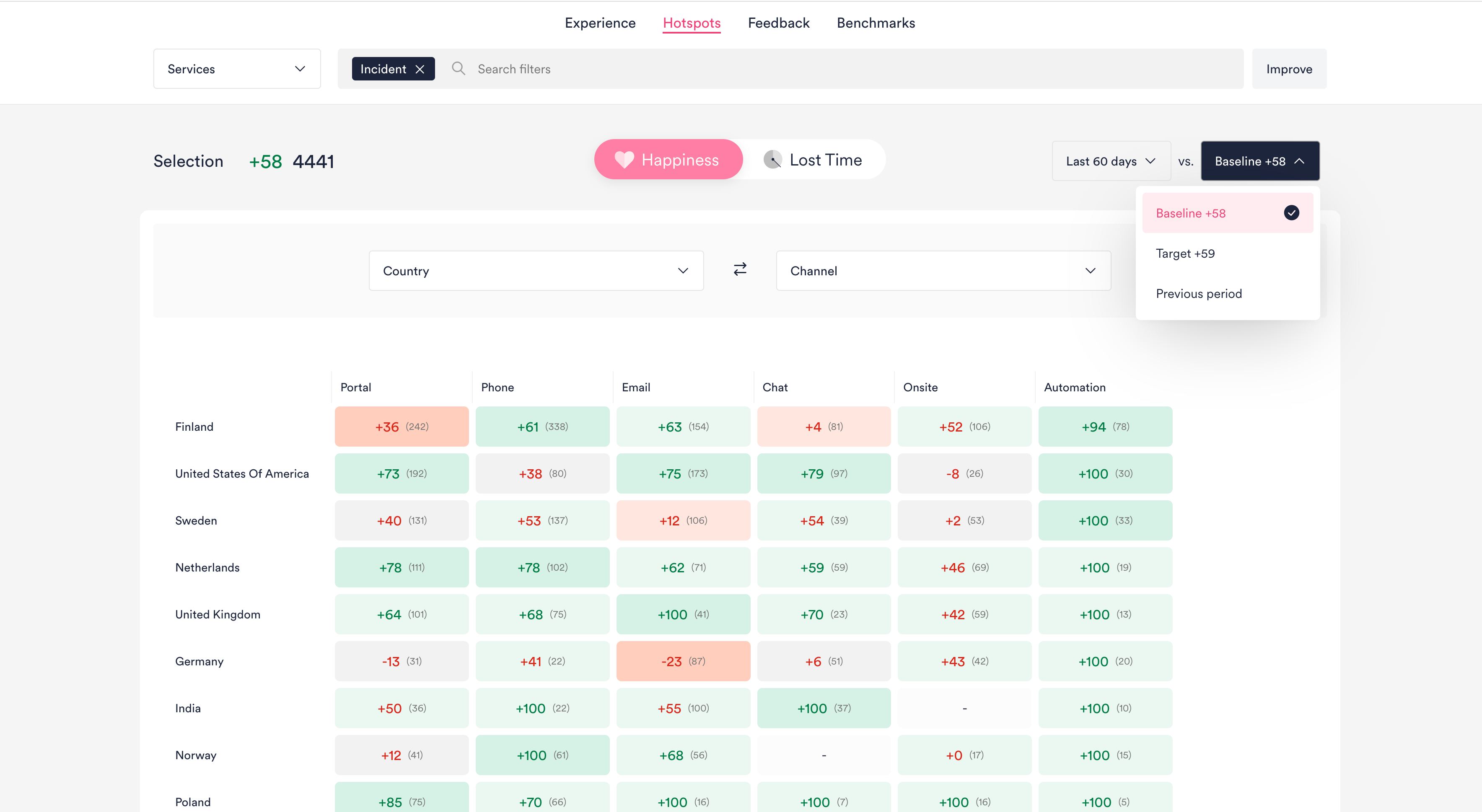
Easily view data across two categories, such as Country and Channel, on a heat map. Here are some example pairs to get you started:
- Country + Channel
- Country + Service
- Service + Business Unit
Just like in the Experience page, you can use the dropdown in the top-right to choose what you wish to compare the data to: Target, Baseline, or Previous Period.
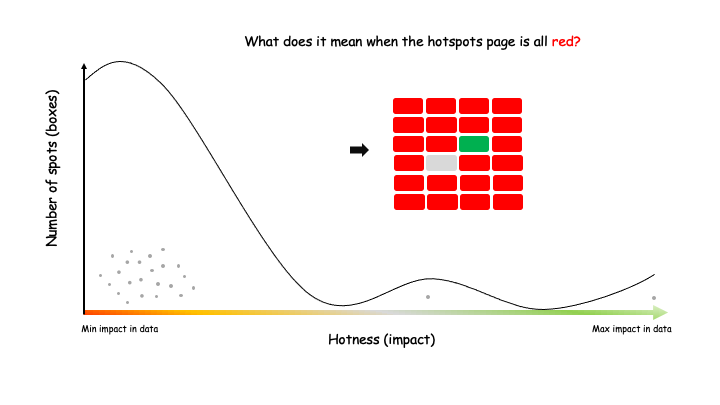
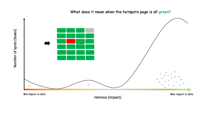
Heat map cells are colored based on Impact
Impact is a calculated based on:
- Number of affected end-users
- Difference between Experience in each area vs. Target/Baseline/Previous period
i.e. Impact = Response volume x (Happiness/Lost Time - Target/Baseline/Previous period)
The Impact-based coloring uses a linear comparison from within your filtered data set, with cells colored from worst to best – represented by red, light red, gray, light green, green.
This approach can be quite sensitive to outliers – areas that have significantly more positive or negative impact than the rest of the areas). In some cases, such outliers will cause the heat map to look very green or very red. Two extreme cases are visualised below: