The short version of what is new in XMP 2.0
- Data model changed: The new model is divided into Service Areas and Measurement Areas.
- IT at a glance on the Dashboard: All Measurement Areas and related graphs are now in one view on the Dashboard to get a full picture of IT at one glance.
- New visual style for Dashboard, Reports/Feedback/Benchmark main navigation, Filter bar, Ticket type selection, Timeframe selector and Edit Shortcut view.
- New Shortcut management: Shortcuts in navigation are now divided into public and private shortcuts, and the owner initials for the public shortcuts are shown. Find your own shortcuts more quickly and know who to talk to about a specific focus area.
- New pre-defined time frames: “This Month”, "Previous Month", "Last 30 days", "Last 60 days" and "Last 6 months" - based on statistics about the most used time frame selections.
- Time frame selector visible on all pages (Dashboard, Reports, Feedback, and Benchmarks), creating a more coherent user experience.
- Selected time frame does not revert to default when moving between Dashboard, Reports, Feedback, and Benchmarks.
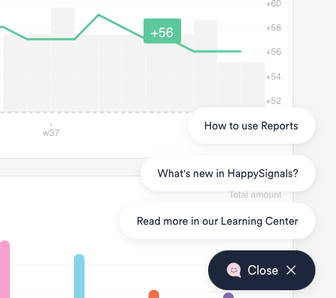
- Built-in content cards with links to useful learning material now displayed on Dashboard.
Select highlights in this release
A completely new "Your IT at a glance" view
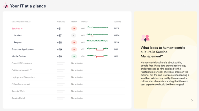
This Dashboard view gives an at one glance view of how end-users feel about different services, making it easier than ever to share access to the platform to all relevant stakeholders, regardless of their technical understanding.
Having built the Dashboard as a great place to start, we also wanted to have built-in links to useful content that helps you to get started with, and understand more about, Human-Centric Experience Management. These content cards are displayed on the right.
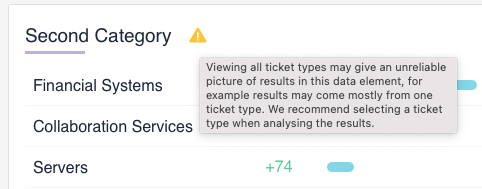
New data hierarchy: Service Areas contain Measurement Areas
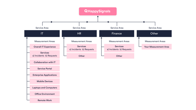
- Service Areas contain Measurement Areas
- The Measurement Areas each correspond to a Survey, which collect Responses from end-users
NB! All existing customer data has already been mapped by HappySignals to ensure a smooth transition to this new data model, with no loss of data.If for any reason you find your data in unexpected places, or feel like something is missing, just get in touch with us and we will be happy to assist.
Main UI Updates
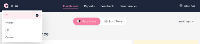
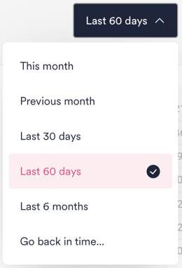 The time frame selection now reflects the most commonly used time frames. Instead of the previous default of 7 days, the default is now 60 days.

New Shortcut Management
We have made shortcut management better on the Reports page. Shortcut management now reflects the same data hierarchy logic that is applied across the whole platform.
Shortcuts are always found in the Service Area that they concern.
More information about shortcuts in the video below, or on the "How to use Reports" page.
Just the right amount of help
On each of the pages (Dashboard, Reports, Feedback and Benchmark), our smiling pink helper in the bottom right corner provides links to helpful content. This includes links to support articles on using that specific page, as well as to our Learning Center and latest product news.
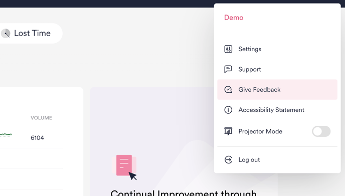
Give feedback about our platform
You can now find a feedback form under the user menu on the top right corner of the platform. With the form you can give us feedback and suggest development ideas. We value any feedback and are eager to hear about how we can make our platform even better.